How We Made This: The Empowered Cultivator Lab
Welcome to our learning design shop at Cultivate! We recently developed a new program called the Empowered Cultivator Lab. You may have heard about it.
For those of you curious about how we create this sort of thing, here's a behind-the-scenes look.
What do we know?
As a team, we always have many ideas about what our next learning program might be. When it's time for product development, we have to get those ideas out of our heads, narrow down the possibilities, and start moving. We begin the process by taking an inventory of the things we believe the program should be and what it shouldn't be.
Here are a few of the things we knew about our Empowered Cultivator program from day one:
Who is this program for?
With our shoulds & should nots in hand, we jammed on the most important part of any learning experience: the people doing the learning. We already have a set of go-to learner personas, so we jumped straight into generating answers to four crucial questions about the program:
Who exactly are we serving?
Where do they want to go?
What mindsets & behaviors might get them there?
How might we support those mindsets & behaviors?
Our brainstorming resulted in a learning objectives list much too long to build into a single program.
Luckily, *there are way too many objectives on this list* is exactly the kind of problem I like to have at this stage in the design process. It's easier to prioritize, combine, and cut objectives during the design process than add more mid-stream, so this long list of aspirations was the perfect jumping-off point for the rest of our design work.
How will we reach people?
Usually, there are more content-related steps between brainstorming learning objectives and choosing a format. In this case, we knew we wanted to focus on introducing the Cultivator skillsets and mindsets that underpin all of our work. We also wanted the program to be self-paced and available any time without sacrificing interaction or real-world practice. We had to figure out how to meet all of those needs at once without incorporating live facilitation or violating any of our other "should nots." So, we started inspiration-hunting.
Folks, if there's one thing I consistently love about my job, it's research. So, excuse me for a moment while I nerd out about what happened next:
The flurry of research activities:
Search for free SMS and email-based programs to sign up for, ask the team to share text or email-based program experiences they've had, and start collecting links & notes:
GirlTrek: Black history bootcamp (email series + synchronous walk & talk)
Highbrow: bouncing back from failure (email course)
Arist: Human-centered design and Introduction to text message learning (SMS courses)
Resilience development company: Reset your mind (email course)
Review a sample of academic journal articles, industry publications, L&D blogs, relevant conference papers on SMS and email-based teaching (while trying to resist the strong pull to READ EVERYTHING THAT HAS EVER BEEN WRITTEN SINCE THE DAWN OF TIME).
Gutiérrez-Colon Plana, M., Gallardo Torrano, P., & Grova, M. E. (2012). SMS as a learning tool: an experimental study. The EUROCALL Review, 20(2), 33-47.
Moura, A., & Carvalho, A. A. (2010, September). Mobile learning: using SMS in educational contexts. In IFIP International Conference on Key Competencies in the Knowledge Society (pp. 281-291). Springer, Berlin, Heidelberg.
So, S. (2009). The development of an SMS-based teaching and learning system. Journal of Educational Technology Development and Exchange (JETDE), 2(1), 8.
HR Magazine - Everything you need to know about micro-learning
Google reWork - Whisper courses: on-the-job microlearning with email
eLearning Industry - How To Set Up The Simplest Email Based eLearning Program
Learning Solutions Magazine - Email: The Overlooked Digital (and Virtual) Learning Platform
Results:
We explored text-based (SMS) programs, but they were too limiting. We looked at a handful of microlearning platforms, but they seemed unnecessary and costly to develop in a tool or app we'd have people use outside of their workflows. We wanted to meet people where they are. We also tried some email-based programs, and while most weren't super-inspiring, we found a couple of examples that got us excited about the possibilities. That's the format we decided to try out for ourselves.
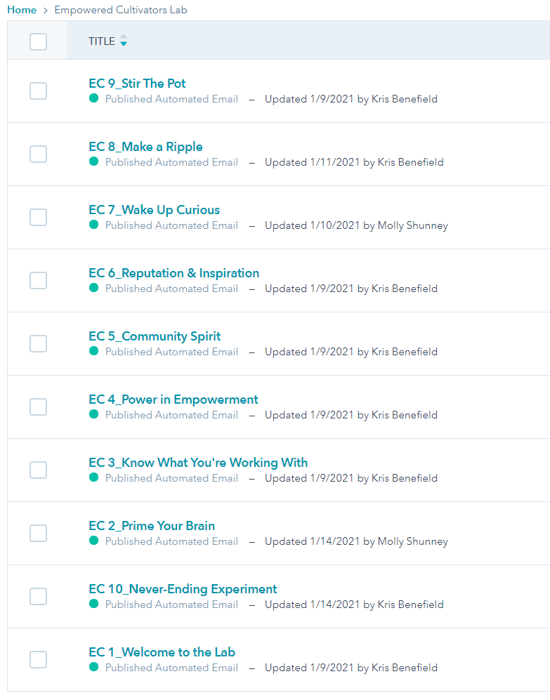
We talked through the examples in our team meetings and distilled some sketchy benchmarks for details like common course lengths, average email word count, use of images, and common email automation platforms. Based on the research and our team discussions, we decided to design a week-long email course. Hubspot (which we use for marketing) would be our content and automation tool. We'd supplement our email content with HTML & PDF resources hosted on our website.
Let's make a program!
At this point, we had our audiences, our draft objectives, our initial research, and a format. The rest was just details.
I'm totally kidding; the rest was a whirlwind of design and development that ate up every extra ounce of brain space for almost three months!
Design Brief
Writing a design brief for a program like this is all about synthesizing the decisions we made in earlier stages. We use this type of document as part of the project kickoff to ensure everyone on the team is on the same page and ready to move in the same direction. Here’s the brief I created and refined with our leadership team.
Outline
Next, I drafted a content outline. Okay, I drafted half a dozen content outlines, reviewing them with teammates, and getting a little closer with each revision. One of the biggest challenges at this stage was prioritizing that long list of objectives, trying to find ways to do as much as possible in a handful of emails. The outline expanded and contracted a few times, from 7 emails to 14 and eventually down to 8.
Even though this version of the plan still didn't feel exactly right, we kept moving forward knowing as we drafted content, we'd make more changes to the topic details and sequence.
Prototypes
Our next step was fleshing out a draft of the email content. My teammate Charles and I tried a little experiment to kick-start that process by choosing one email from the outline to draft independently within the same set of constraints:
Align with the objectives
No more than 800 words
No more than four images
Include additional resources/links
Our goal was to review our unique approaches to the emails' content and choose the elements that worked best from each of our versions. We also wanted to determine whether the constraints were too limiting and adjust them as-needed before drafting the remaining emails. Lastly, we wanted to make some high-level decisions about a consistent format and visual style, and these initial prototypes were a quick way for us to experiment with those different options.
Content Draft
After we compared, contrasted, and combined the best elements of our prototypes, it was my turn to take a pass at drafting the entire set of emails.
For me, drafting is a rapid, recursive process that involves ongoing research, dedicated writing time, and quick review sessions to push through sticking points. I get militant about time-management at this stage because my work is SO much better if I can find time to draft a piece of content, step away from it for at least a day, and come back to it with fresh eyes.
For this project, I would draft an email and then set it aside while moving on to an illustration, assessment, or other resource. I'd come back later, review & revise the first email, and draft the next. I repeated the process, reviewing a larger stack of previously-drafted emails each time to incorporate what I was learning. I left the introduction and conclusion emails for the end of the process to align them with the rest of the content.
One of the biggest hurdles we had to overcome during the drafting stage was the trap of passive content-consumption. In the email Charles drafted during our prototyping stage, he referenced the movie Meet the Robinsons, which revolves around a child-scientist who loves to experiment. As I revisited the email, I was expanding on the idea of experimentation and the importance of cultivating a risk-taking, curiosity-driven mindset, and I had a mini-stroke of inspiration:
What if, instead of choosing a topic for every email, we chose an experiment? We use experiments in our own work all the time, and since experiments require action, what better way to get the participants to bridge the gap between their digital inboxes and the real world?
This is where the "lab" in "Empowered Cultivator Lab" was born, and that concept would become a crucial thread used to tie the entire program together. Bubbling with excitement, I took the idea to Molly, our Marketing & Communications Lead, to see if it sounded as fun to her as it did to me. She was immediately on board and thinking through possible angles for the visual design that would complement the "lab" theme. I knew we had a winner. On my next pass through the content, I incorporated the experiment-centered approach into each email draft, and everything started to fall into place.
Review, Revise, Repeat
Once we had a complete rough draft in hand, we turned over all 12 emails (~18 pages of content) to the leadership team for a review. Three review meetings + 37 in-line comments later, I had everything I needed for the first major revision. One of the most significant changes we needed to make was scaling back to 10 emails (two business-weeks of content). That meant condensing, cutting, and re-prioritizing about 50% of the draft.
Amidst another sprint full of revisions, our entire team had a chance to review the updated versions of the first two emails.
My favorite feedback was related to our content on mental models:
Here's what Molly shared in our Slack thread:
So, we dropped our musk deer friend and continued reviewing and revising based on everyone's feedback until it was time to hand off the content to our MarComm team to build everything in Hubspot.
Visual & resource design
Molly and Abel took the reins to translate all the content and image placeholders into something more visually appealing. They established a visual identity, color palette, and 30+ graphics – some as simple as a text bubble and others as complex as a new graphical model representing all the essential skills that make up our "Cultivator DNA."
Some of the fun for me at this stage came from the chance to work closely with Abel for the first time. We met to brainstorm ideas, review early drafts, and ensure all the graphic designs would support & enhance the content, while also staying aligned with the visual identity.
At the same time, the great & powerful Charles got to work designing a whole stack of PDF resources that would supplement each experiment. He also tested and selected a new survey tool and started building our new "Cultivator Inventory” (a self-assessment we designed for day two of the program).
One of our favorite visual designers, Christian Baum, also jumped in at this stage to develop a couple of the more complex images for the program.
Even more testing & iterating
While the visual and resource design were wrapping up, we reached out to external reviewers who matched our target audience personas to test our drafts and incorporate their feedback into our final revisions.
We heard a lot of positive feedback from our reviewers, along with revealing questions like, "do I have to participate in the community?" (which told us we needed to do a better job of introducing and explaining the community elements of the program). Helpful suggestions like "a more consistent structure for the content and experiments would make them easier to absorb" led us to focus on email structure consistency. A comment that "The 'Kris' persona doesn't feel real" reminded us to make it clear in the first email that I'm actually a real human and not a made-up email persona.
After we synthesized and addressed our external reviewers' feedback, we went through several more rounds of iterations as a team, including a final spit-shine and copy edit to ensure we crossed all of our t's before launch.
Launch!
Now our learners are experiencing the program, and we’re collecting as much info as we can about their satisfaction, engagement, and participation in the experiments & the community. We’ll use that data to continuously improve the program over time and to refine our plans for repurposing specific program resources in different ways in the future (e.g. for live learning programs, community events, blog posts, etc.).
If you read all of this and you haven't signed up to try the email program for yourself, sign up now!
Share your ideas. Solve problems. Make a difference.
We’re building a community where your voice is heard, solutions are shared, and changemakers around the world can mobilize for change. If you are passionate about change, culture, and innovation, this is the place for you.


